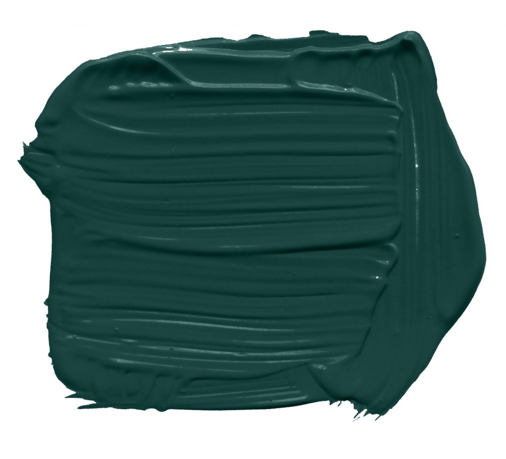
With the year coming to an end, we can finally announce the undisputed interior colour of the year: Night Watch. A deep vibrant green, inspired by nature in all its forms.
The hue is rich and intense, with a reminder to the brighter emerald. Inspires calm and tranquillity while maintaining a strong presence on the surrounding. We used this colour in almost every possible settings, from living room backdrop, to bathroom protagonist.
Read more for tips and tricks on how to best use Night Watch in your home.
We used Night watch throughout 2019, always aiming to create relaxing environment. The modern home becomes a reflection of natural panoramas, bringing comfort and wellbeing to their inhabitants. The color is quite versatile, and well match different styles, we used it in more industrial settings, as well more traditional, rich and velvety setups.
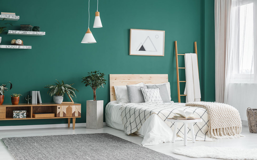
The bedroom
In the Bedroom, Night Watch is used as a backdrop. The darker tone help in creating additional volumes while keeping the room dimmed and cozy.
It works well with bright linen, dark grey silky covers and warm orange lighs. Simple glass and white ceramic shapes additionally complement an already very natural vibe.
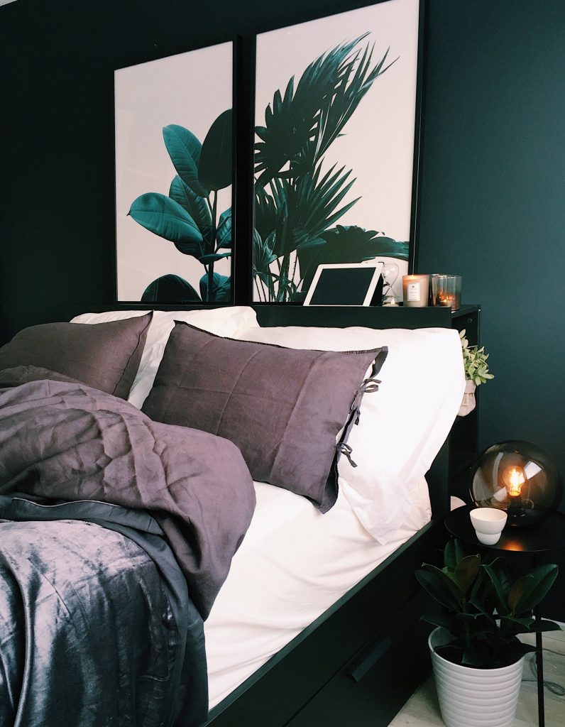
Adding additional references to nature, both artificial as a painting or natural as a plant helps building on the jungle-ish atmosphere.
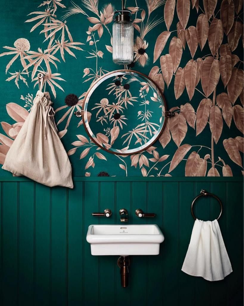
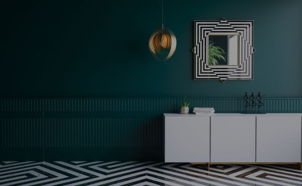
The bathroom
Night Watch’s forte comes through in the bathroom, usually the smaller rooms in the house. We used it both as main wall colour, as well as for finishing touches on furnitures.
The versatile of the green hue allowed us to play with multiple shades of pinks and whites. The rose gold brass and the opaque copper are the perfect finishing for the environment. We leave all the rest as simple as possible, letting our favorite hue to make the boldest statement in the room.

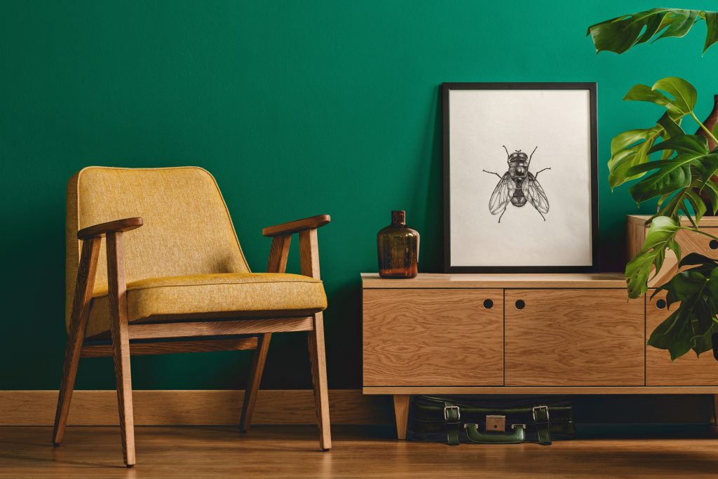
The Living room
If it wasn’t clear enough, we love Night Watch for its versatility. That came trough during the multiple living rooms that we arranged. From covering all the walls in the room, to just simple accents, this green always delivered on the expectations.
Usually a brighter room than the one in the rest of the house, the living room opens up to even more matching. Textured wood, opulent marble and metal gold are all great companion of this natural green. Mustard yellow and creamy beige are perfect complementary colours.
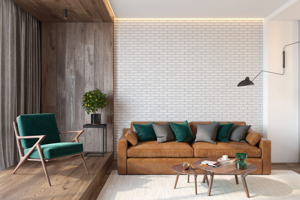
When not used as main colour, Night Watch plays uniquely well with dark and earthy leather materials, and dark wooden furnitures.